
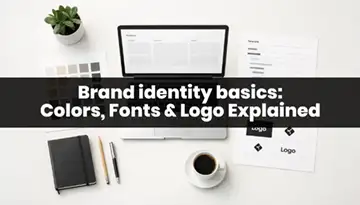
Brand identity basics – colors, fonts & logo build trust because they make your brand look consistent and professional. When people see the same style everywhere, they feel your business is real, reliable, and worth their time.
Let’s be honest… people judge fast
In real life, we all do it.
If a shop board looks messy, we assume the service may be messy too.
If a website looks clean, we feel safer to click, read, and buy.
That “safe feeling” is trust.
And trust is the first job of branding.
Your Brand Identity Basics — colors, fonts, and logo — are like your brand’s clothes.
If the clothes are clean and match well, people feel comfortable.
If they look random, people get confused. And confused people don’t buy.
What trust looks like in design (simple signs)
A brand feels trustworthy when:
- The same colors repeat across posts, website, and ads
- The same fonts are used again and again (not new fonts every design)
- The logo looks clear even in small size (like Instagram DP)
- The layout has space (not everything crowded)
This is what clients notice, even if they can’t explain it.
Example: Local café (real-life branding)
Imagine two café Instagram pages:
Café A
- Every post has different colors
- Different font every day
- Logo changes or disappears
- Menu designs look like “random Canva experiments”
You might think: “Nice… but is this place stable?”
Café B
- Same warm brown + cream colors
- Same 2 fonts
- Logo always in the same place
- Menu looks consistent
You instantly feel: “This café is serious. Let’s try it.”
Same coffee. Different trust.
The trust equation (super simple)
Consistency → Clarity → Trust → Action (click / call / buy)
Brand Identity Basics are not decoration.
They are a shortcut to clarity.
Quick action: How to build trust in 30 minutes
Do this today (even for your own brand):
- Pick 1 primary color + 1 accent color + 2 neutrals
- Pick 2 fonts only (heading + body)
- Make sure your logo has:
- a full version
- a small icon version (for DP / favicon)
- Update your last 6 posts using the same style
That’s it. You will feel the trust level go up.
Mini takeaway
If your brand looks consistent, people feel safe. And safe people convert.
Branding in 2 Minutes (Branding Is Not Just a Logo)
Branding is the full system of how your business looks and feels—colors, fonts, logo, layout, images, and tone. A logo is just one piece. Branding is what makes people recognize you and trust you across every platform.
The biggest branding myth (and why it hurts designers)
A lot of people say:
“Bro, just make my logo.”
And designers also sometimes think:
“If the logo is strong, branding is done.”
But here’s the truth:
A logo alone cannot carry your brand.
Because people don’t see your brand in one place.
They see it everywhere—Instagram, website, YouTube thumbnail, WhatsApp brochure, Google listing, email signature, packaging, visiting card… the list never ends.
So branding is not one design.
Branding is a repeatable design system.
A super simple definition (no fancy words)
Branding = what people remember about you when you’re not in front of them.
And visually, it’s mainly built from:
- Colors (your mood + recognition)
- Fonts (your voice + clarity)
- Logo (your signature mark)
- Layout rules (spacing, alignment, style)
- Image style (photo look, illustration look, AI style)
- Tone (how you write and speak)
So yes, logo matters.
But branding is bigger than the logo.
Real example: A startup vs a “brand”
Let’s say two companies sell the same product: protein powder.
Company A (startup look)
- Random bright colors on posts
- Many fonts on one poster
- Logo keeps shifting position
- Packaging and website look different
What people think:
“Is this real, safe and reliable?”
Company B (brand look)
- One strong color system across everything
- Same fonts on website + posts + packaging
- Same logo placement rules
- Images look like they belong together
What people think:
“This looks like a serious brand.”
Same product.
Branding makes the difference.
The “Brand System” checklist (for designers)
If you’re building Brand Identity Basics, don’t stop at logo.
You need:
- Color palette (primary + secondary + neutrals + accent)
- Typography (heading + body + basic hierarchy)
- Logo set (main + icon + black/white versions)
- Layout style (grid, spacing, corner radius style)
- Image direction (photo style or illustration style)
- Mini brand guide (one-page rules)
This is what makes you look like a “branding designer”, not only “logo designer”.
Quick mini exercise
Open any brand you trust (Nike, Apple, Starbucks, Zomato—anything).
Now ask:
- Do they keep colors consistent?
- Do they keep typography consistent?
- Do they use a logo system (big + small)?
- Do their images look like one family?
If yes, you just saw branding in action.
Small takeaway
A logo is a face.
Branding is the whole personality.
Colors (Brand Identity Basics Made Simple) — With Examples You’ll Actually Use
In branding, colors build trust by creating a consistent mood and helping people recognize your brand fast. Use one primary color, 1–2 supporting colors, neutrals, and one accent color for highlights.
Colors are not “just decoration”
Let me say it in a very designer-to-designer way:
Colors are the fastest thing people notice.
Even before they read the headline. Even before they understand the offer.
That’s why good brands don’t “pick random nice colors.”
They pick colors that repeat everywhere.
And repetition is what builds trust.
When your audience sees the same colors again and again, your brand starts feeling familiar.
And familiar = safe.
The 3 jobs of brand colors (simple and real)
Colors do three main things:
- Mood: premium, friendly, bold, calm, luxury, playful
- Recognition: people start identifying your brand without reading
- Attention: colors guide eyes (CTA button, price, highlights)
So when a client says, “Make it more attractive,” many times they actually mean:
“Make it clearer where to look.”
Color helps you do that.
A super easy color palette formula (copy-paste this thinking)
If you want clean branding, use this structure:
- Primary color (1) → your main identity color
- Secondary colors (1–2) → support the primary (backgrounds, sections)
- Neutrals (2–3) → white / off-white / grey / near-black
- Accent color (1) → only for highlights like buttons, offers, links
This keeps your brand looking “designed” instead of “decorated.”
Example 1: A modern tech brand palette (trust + clarity)
Let’s say your brand words are: Modern, clean, reliable.
A palette could be:
- Primary: Blue (trust vibe)
- Secondary: Soft cyan or light blue
- Neutrals: White + light grey + dark grey
- Accent: A small pop like orange (only for CTA)
Now imagine:
- Website buttons in accent orange
- Headlines in dark grey
- Background in soft grey
- Blue used for brand identity blocks
Suddenly everything looks structured.
Not noisy. Not random.
That’s trust.
The biggest color mistake designers make (and clients push us into)
You know this one…
Client: “Use more colors so it looks exciting.”
And then we end up with:
- 6 bright colors
- gradients everywhere
- neon text
- 4 types of shadows
Result: It looks like a carnival poster.
Not a brand.
Exciting doesn’t mean colorful.
Exciting means clear message + good contrast + smart accent use.
“How do I choose my brand colors?” (simple method)
Do this in 10 minutes:
- Write 3 brand words
Example: “Premium, bold, modern” - Pick one primary color that matches those words
- Pick neutrals first (this is the secret)
- Add 1 accent color only for action areas
Designers who start with neutrals create cleaner brands.
Contrast: the trust test (this is important in 2026)
Even if your palette is beautiful…
If the text is not readable, your brand looks weak.
So do this quick check:
- Put your text on the background color
- Zoom out
- If you need effort to read, your audience will scroll away
A simple rule many accessibility standards follow:
- Normal text should have strong contrast (often 4.5:1 is used as a benchmark)
- Large text can be lower (often 3:1)
You don’t have to become a “technical person.”
Just remember: readability = trust.
Quick checklist for brand colors (fast and practical)
Before finalizing colors, check this:
- Can I use these colors on website + Instagram + print?
- Does my accent color work for buttons and highlights?
- Do I have enough neutrals to let content breathe?
- Are my text + background combinations readable?
If yes, your colors are ready.
Mini takeaway (one line)
Good brand colors are not many colors.
Good brand colors are repeatable colors.
Fonts (Typography) — Simple Rules + Real Examples
Fonts in branding shape how your brand sounds and feels. Use 2 fonts (one for headings, one for body), keep clear hierarchy, and stay consistent across every design to build trust.
Fonts are “voice”, not decoration
Colors catch attention fast.
Fonts do something different.
Fonts create the tone.
Same sentence. Two different fonts.
One feels premium another feels playful. One feels “cheap another feels “corporate.”
And the funny part is… most clients can’t explain it.
They only say: “This looks professional” or “This looks off.”
That “off” feeling usually comes from messy typography.
So if you want trust, typography is your best friend.
The 2-font system (clean branding hack)
If you do only one typography thing right, do this:
- Font 1: Heading font (for titles, highlights)
- Font 2: Body font (for paragraphs, descriptions)
That’s it.
Not 4 fonts.
Not “one new font per post.”
Two fonts = consistency.
Consistency = trust.
How to choose the right heading font (simple thinking)
Ask: “What should the brand feel like?”
A few easy matches:
- Modern / Tech: clean sans fonts, sharp edges, strong weights
- Luxury / Premium: elegant serif or classy sans with good spacing
- Friendly / Youth: rounded sans, softer shapes
- Traditional / Serious: classic serif or strict sans
You don’t need to learn all font history.
Just choose a font that matches the brand vibe.
The biggest font mistake: “Too many fonts = too many moods”
When you use 4 fonts, you are basically saying:
“I don’t know who I am.”
It creates noise.
And in branding, noise kills trust.
A simple rule:
- One brand should not look like 5 brands on 5 different days.
Typography hierarchy (this is where designs become “designed”)
Hierarchy means: what should people read first?
If everything is same size and same weight, the design looks flat.
People don’t know where to look.
So use this simple hierarchy stack:
- H1 (Main headline): biggest, strongest
- H2 (Support line): smaller, still clear
- Body text: simple, readable, comfortable
- Caption/Note: smallest, lightest
Even if your layout is basic, hierarchy makes it look professional.
Spacing: the secret weapon most designers ignore
Fonts don’t work alone.
They need breathing room.
Two spacing rules that instantly improve design:
- Increase line spacing for body text (so it doesn’t look cramped)
- Don’t stack too many lines in one block (break into small paragraphs)
If you want “premium” feel, spacing is 50% of it.
Latest trend (useful, not hype): Variable fonts
In modern web and UI work, variable fonts are popular because:
- you can control weight smoothly (not only 400, 600, 700)
- they work well across screen sizes
- you can keep the same font family while changing style
For designers, this means: more control, less font switching.
But again, trend is optional.
Consistency is not optional.
Mini takeaway
Good typography is not fancy.
Good typography is clear + consistent.
Logo (Logo Basics That Work in Real Life) — With Examples + Checklist
A good logo is clear, recognizable, and works in small sizes. The best logos have simple shapes, strong spacing, and multiple versions (full logo, icon, black/white) so they look good everywhere.
A logo is not an artwork. It’s a tool.
This line helps a lot when clients say:
“Make it more creative.”
Yes, creativity is good.
But a logo has a job:
It must work on a tiny Instagram DP… and also on a big banner… and also on a bill… and also on a favicon.
So instead of asking, “Is it beautiful?”
Ask: “Is it usable?”
That’s the real logo test.
What makes a logo “work”? (simple checklist)
A logo is strong when it is:
- Simple: easy to remember
- Readable: the name is clear (if there is text)
- Scalable: looks good small and big
- Recognizable: you can spot it fast
- Works in one color: black/white test
- Works on light + dark backgrounds: not only one background
If your logo passes these, you already won.
The “small size test” (most logos fail here)
Open your logo.
Make it the size of a WhatsApp DP or Instagram icon.
Now ask:
- Can I still understand it?
- Do the details disappear?
- Does it look like a blur?
If it becomes a blur, the logo is too complex.
Simple wins in 2026 because most people see logos on phones first.
The modern logo approach: “Responsive logo set”
In 2026, one logo is not enough.
You need logo versions for different spaces.
A simple responsive set looks like this:
- Primary logo: full version (logo + name)
- Secondary logo: shorter version (name + icon or simplified)
- Icon/logo mark: square icon for DP, app, favicon
- Black version + white version: for different backgrounds
This is the part many clients don’t know.
When you explain this, they instantly feel you are a pro.
The “logo + branding” connection (important)
A logo doesn’t live alone.
If your colors and fonts are weak, even a great logo looks average.
But if your colors and fonts are consistent:
Even a simple logo looks premium.
That’s why Branding Identity Basics work as a system:
colors + fonts + logo together build trust.
Common logo mistakes (quick and honest)
Here are mistakes that destroy trust:
- Too many tiny details
- Too many concepts in one logo
- Using trendy effects that won’t age well
- Not having black/white versions
- No icon version for social media
- Random spacing and alignment
The fix is not “more creativity.”
The fix is simpler structure + better usability.
A great logo is the one that works everywhere, not the one that looks complex.
Put It Together — The 1-Page Brand Style Guide (Fast + Practical)
A 1-page brand style guide is a simple document that shows your brand colors, fonts, logo versions, and basic usage rules. It keeps every design consistent, which builds trust and makes your brand look professional.
Why this one page changes everything
Most brands don’t fail because the designer is weak.
They fail because there are no rules.
So every time someone makes a poster, a story, a brochure, a visiting card…
they make “fresh decisions” again.
New font, new shades and new logo placement.
And slowly the brand becomes a mess.
A 1-page brand guide solves this.
It’s like giving your brand a simple “instruction manual” so nobody ruins it by mistake.
What to include in a 1-page brand guide (simple template)
Keep it minimal. Don’t make it a 40-page PDF.
Use this structure:
1) Logo section
- Primary logo (full)
- Secondary logo (short)
- Icon mark (square)
- Black + white versions
- Clear space rule (simple)
2) Color section
- Primary color + hex code
- Secondary colors + hex
- Neutral colors + hex
- Accent color + hex
3) Typography section
- Heading font (name + weights)
- Body font (name + weights)
- Basic hierarchy sizes (H1, H2, Body)
4) Basic usage rules (Do / Don’t)
Keep it short. 4–6 bullets is enough.
Do
- Use same fonts everywhere
- Use brand colors for backgrounds and buttons
- Keep logo in correct colors
Don’t
- Stretch the logo
- Add shadows and 3D effects
- Change font style randomly
5) Bonus (optional but powerful): Social media post example
Add one sample layout:
- where logo goes
- where headline goes
- how spacing looks
- how colors should be used
This makes implementation super easy for the client.
Why this guide helps YOU as a designer (big benefit)
A 1-page guide:
- reduces revisions (“Why did you use this font?”)
- makes clients respect your process
- prevents random changes later
- helps you charge more (because you’re building a system, not just a logo)
This is how you shift from “graphic designer” to “brand designer.”
Mini takeaway (one line)
If you want trust, give the brand simple rules. A 1-page guide is the easiest way.
Common Branding Mistakes (That Make Good Design Look “Not Premium”)
The most common branding mistakes are using too many colors, too many fonts, a complex logo, weak contrast, and no brand guide. Fix them by simplifying your palette, using 2 fonts, creating logo versions, and keeping rules consistent.
Let’s talk about the mistakes we all make (yes, even pros)
Most branding issues are not because you “don’t know design.”
They happen because:
- the brand has no rules
- the client keeps changing directions
- you’re rushing to meet deadlines
- you’re trying to impress with too many ideas
And the result is always the same:
The brand looks inconsistent.
So people don’t trust it.
Now let’s fix this in a very practical way.
Mistake 1: Too many colors (the “rainbow brand” problem)
This is the most common one.
A designer picks:
- 1 nice blue
- 1 nice purple
- 1 neon green
- 1 orange
- 1 pink
…and suddenly the brand has no identity.
Example:
Instead of using 6 colors in one Instagram post, use:
- neutral background
- dark text
- primary color for highlights
- accent color only for CTA
The post instantly looks premium.
Mistake 2: Too many fonts (the “Canva font buffet”)
You make one poster and use:
- one font for heading
- another font for subheading
- another for body
- another for price
- another for CTA
It looks “designed” to you while making it…
But to the audience, it looks messy.
Micro-tip:
If your heading font is loud, keep body font simple. Always.
Mistake 3: A logo that fails on mobile
Client asks for “unique” and you create a logo with:
- tiny lines
- small icons
- too much detail
- thin strokes
Looks great on your monitor.
But on a phone icon? Gone.
Mistake 4: Weak contrast (design looks soft, but unreadable)
This mistake is silent but deadly.
Light grey text on white background.
Pale yellow on beige.
Thin font on bright gradient.
It may look “aesthetic” but it kills readability.
Quick phone test:
Open the design, reduce brightness, step back.
If you struggle, users will struggle more.
Mistake 5: No spacing (everything crowded)
Crowded design feels cheap.
Even if your fonts and colors are good, poor spacing makes it look like a “flyer”, not a brand.
Mistake 6: Inconsistent logo placement
Today logo is top-left.
Tomorrow bottom-right.
Next week middle.
Sometimes it’s missing.
This destroys brand memory.
Mistake 7: Copying trends without matching the brand
This happens a lot now.
Someone sees a viral “bold typography + neon gradient” style.
They use it for a corporate law firm.
Boom. Brand mismatch.
Quick Fix Checklist (save this)
When your branding feels “off”, check:
- Do I have a simple palette (not too many colors)?
- Am I using 2 fonts only?
- Is my logo readable in small size?
- Is the text contrast strong?
- Is there enough whitespace?
- Is logo placement consistent?
- Does the style match the brand personality?
If you tick these, you are already ahead of most brands.
Most branding problems are not creative problems. They are system problems.
Conclusion: Brand identity basics
If you remember only one thing, remember this:
Trust is built through consistency.
You don’t need: a complicated logo, 12 colors, and 6 fonts.
You need a simple system that repeats everywhere:
- Colors that feel like your brand
- Fonts that stay readable and consistent
- Logo that works on phone and print
- And one 1-page brand guide so nobody breaks the brand later
Branding is not about showing off design skills.
Branding is about making people feel safe.
And when people feel safe, they click, follow, and buy.
FAQs: Brand identity basics
1) What are Brand Identity Basics?
Branding Identity Basics are the main visual elements that build recognition and trust: colors, fonts, logo, and simple style rules for consistency.
2) How do colors help in branding?
Colors create mood, help people recognize your brand faster, and guide attention to important parts like buttons and offers.
3) How many colors should a brand use?
A simple brand palette usually works best:
- 1 primary
- 1 accent
- 2–3 neutrals
- 1–2 secondary colors (optional)
4) How many fonts should I use in a brand?
For most brands, 2 fonts are enough:
- one for headings
- one for body text
Using too many fonts makes the brand feel messy.
5) What makes a logo good?
A good logo is simple, clear, scalable, and works in small sizes. It should also have black/white versions and an icon version for social media.
6) Can I start branding without a logo?
Yes. You can start with colors + fonts + layout style first. A clean system can build trust even before the final logo is ready.
7) What is a 1-page brand style guide?
It’s a single page that shows your:
- logo versions
- color codes
- font choices
- basic do/don’t rules
It keeps every design consistent.
8) What’s the biggest branding mistake?
The biggest mistake is inconsistency—changing colors, fonts, and styles often. It confuses people and reduces trust.
1 comment
Comments are closed.

[…] It becomes the brand’s voice. […]